Neiman Marcus Connect
Building a design system from the ground up
- Role
- Design system owner
- Team
- 4 designers · engineering partners
- Scope
- Foundations · components · documentation · analytics
- Timeline
- 2022 → ongoing
- Status
- Adopted org-wide
Problem
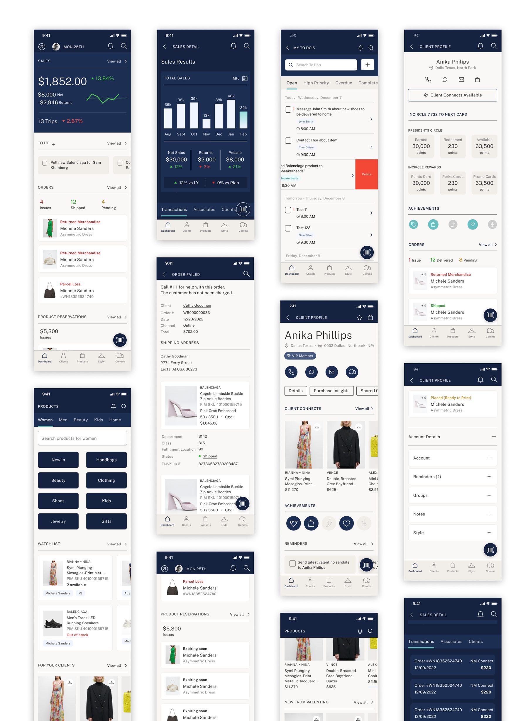
A newly hired team of five designers was re-platforming the Connect app with no source files, no design system and no process. Inconsistencies appeared within weeks.
Solution
Build the system while the team kept designing: foundations first (type, color, icons), then small components, then composite components assembled from them, with usage notes baked in.
Result
A living system maintained through peer feedback, Figma feature updates and usage analytics, now the single point of reference for designers and engineers.
When I joined the team at Neiman Marcus, I was hired to work on the re-platforming of the Connect App. Joining a team of 4 other designers, I assumed there would be some sort of process to follow, a system in place, a defined roadmap.
I was mistaken.
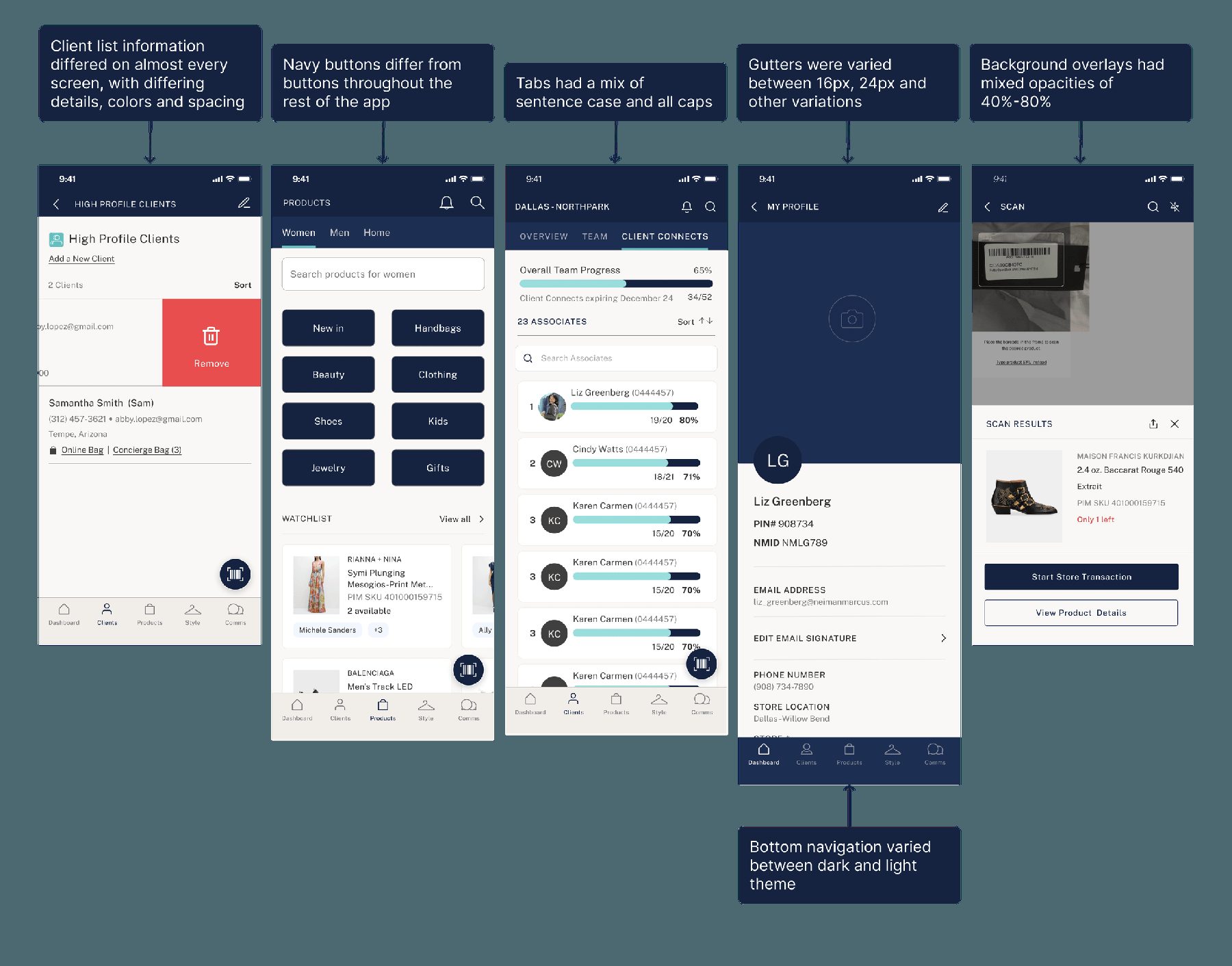
Our team was made up of newly hired designers, meaning we were thrown into the deep end. We had no Sketch or Illustrator files with designs from the current platform, no design system, and no formal process for re-platforming. Given time constraints, the team had dived head first into redesigning, and immediately I started to notice inconsistencies between each designer's work.
The beginning
I began by collecting all the files we were currently working on, identified inconsistencies between components, and began discussions to understand what we wanted in our system.
My approach
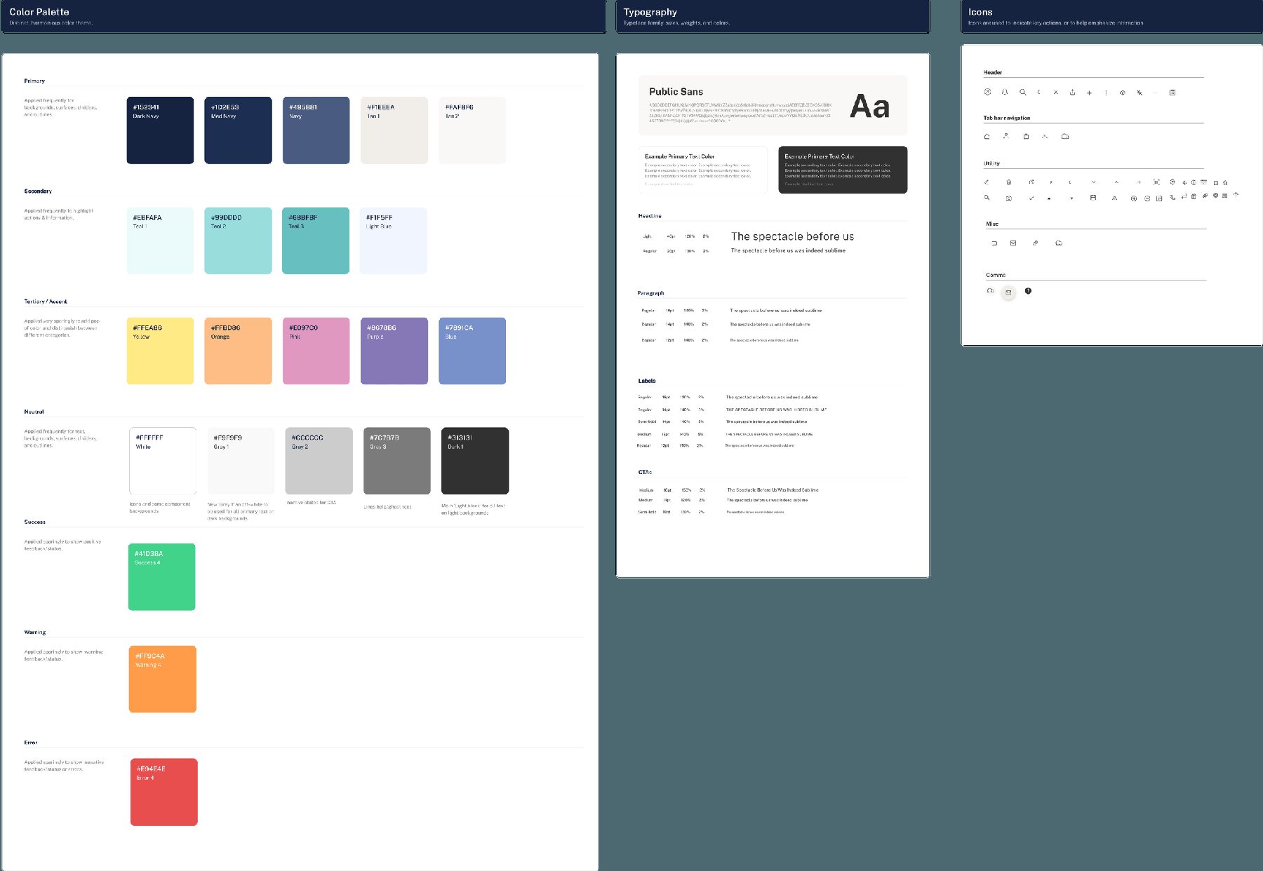
Given that I was building a design system whilst my teammates were designing new screens by the minute, I took a methodical approach. I began by establishing a font library, a color library, and an icon library. These acted as foundational pieces that allowed me to begin building components.
Educating the team on the system
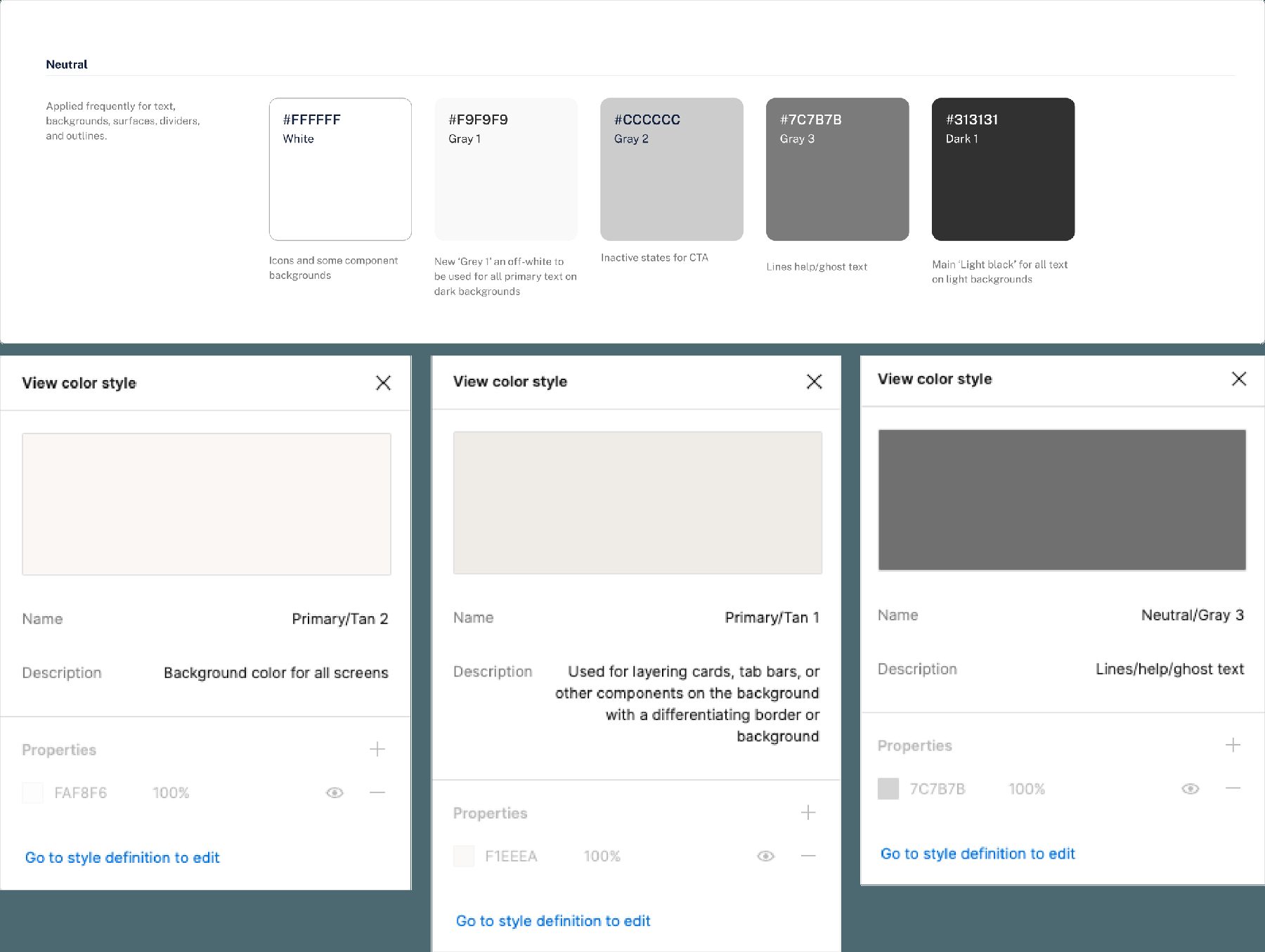
To reduce friction and encourage my teammates to begin using the system, I included notes on the color library providing additional information regarding when to use which colors. This ensured consistency among team members' designs.
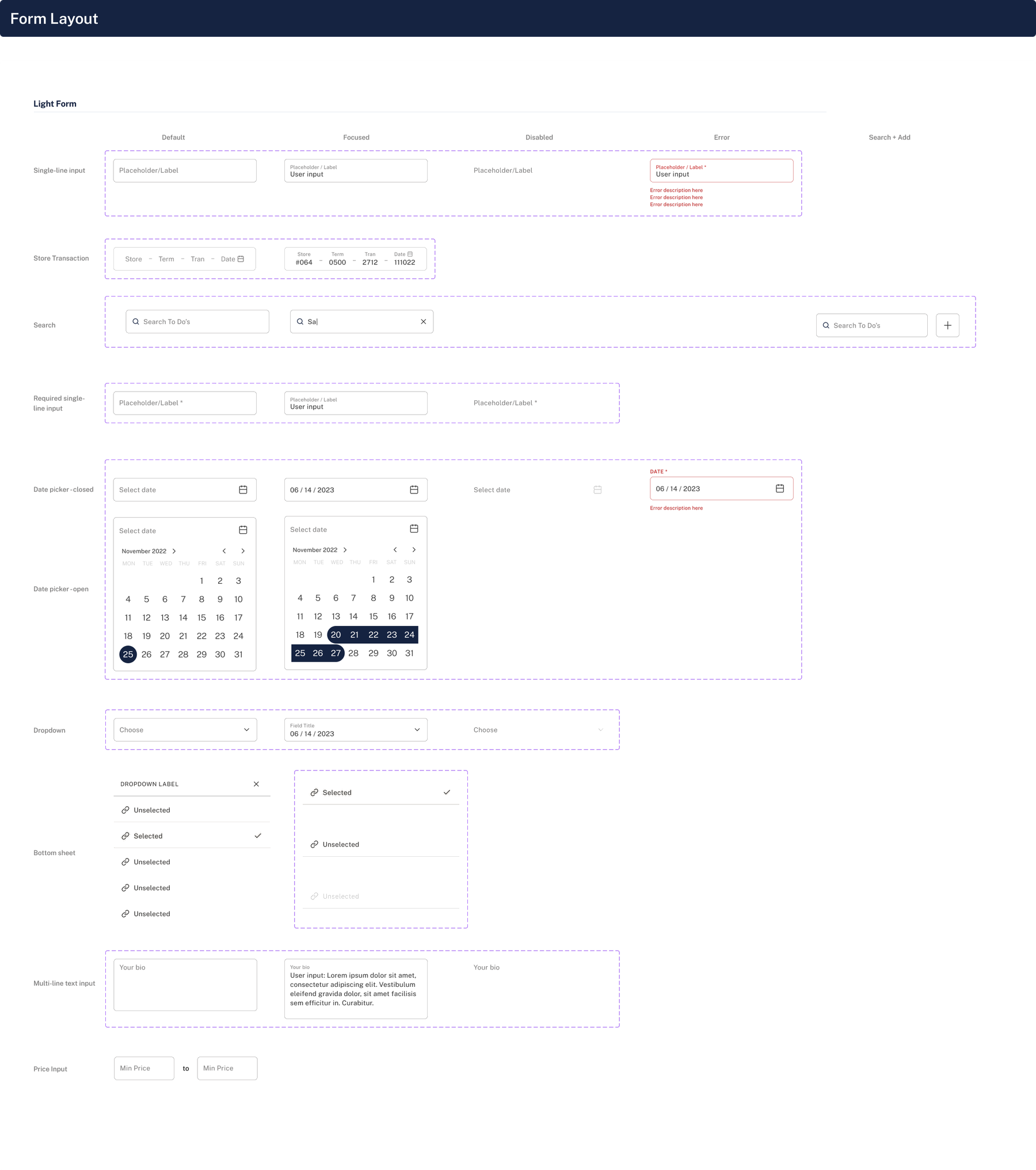
Creating reusable components
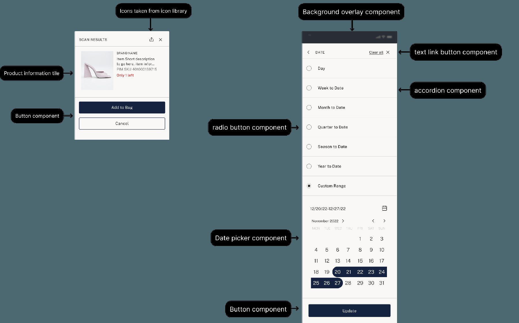
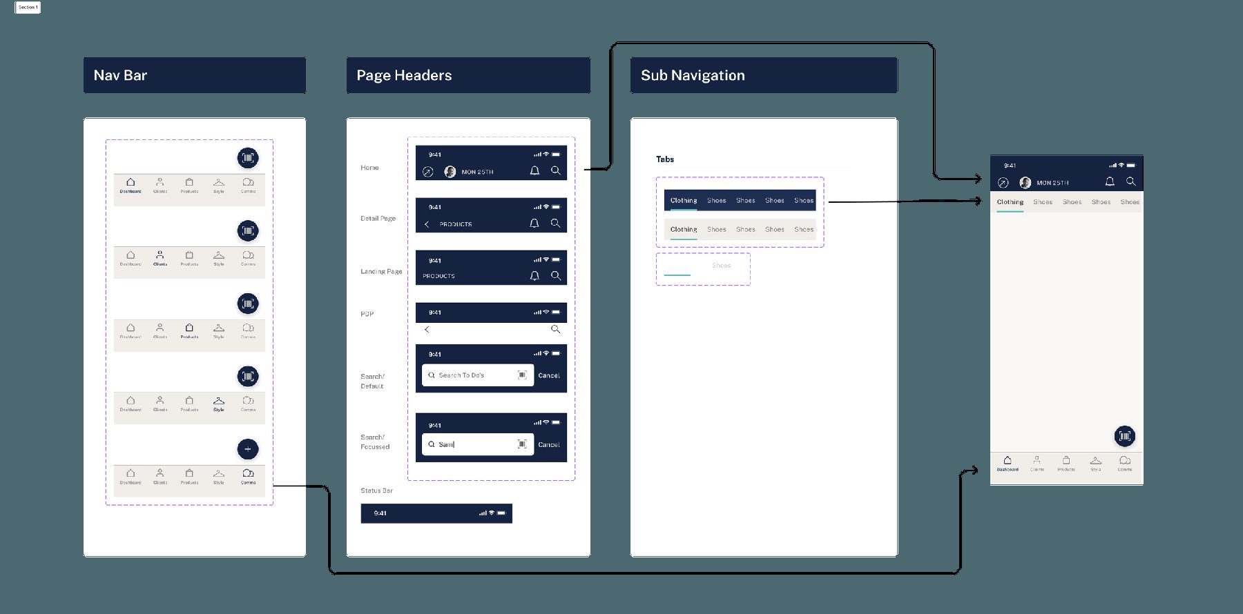
I continued building out the design system with components such as navigation bars, page headers, sub-navigation, accordions, text links, buttons, product cards, progress bars, and more.
From there, I started reusing these smaller components to build robust larger components, so that every bigger component was made up of smaller reusable elements.
Maintaining the system
Equally as important as building the system was maintaining it. I maintained the system in three ways:
- Peer feedback: issues flexing/shrinking components, changing states
- Figma updates: adapting the system to new features such as min/max width, variables and advanced prototyping
- Progressive build-out: adding components on a needs basis
Design system analytics
Aside from ongoing communication with my team, another tool I use to assess the usefulness of the design system is Figma's built-in analytics. These expose which components are used most often, how many times components are detached from their primary component, and even which instance is most used.
I observe the usage here and will often go back to my team and ask why they don't use certain components, so that I can remove unnecessary ones or edit their composition for easier use.
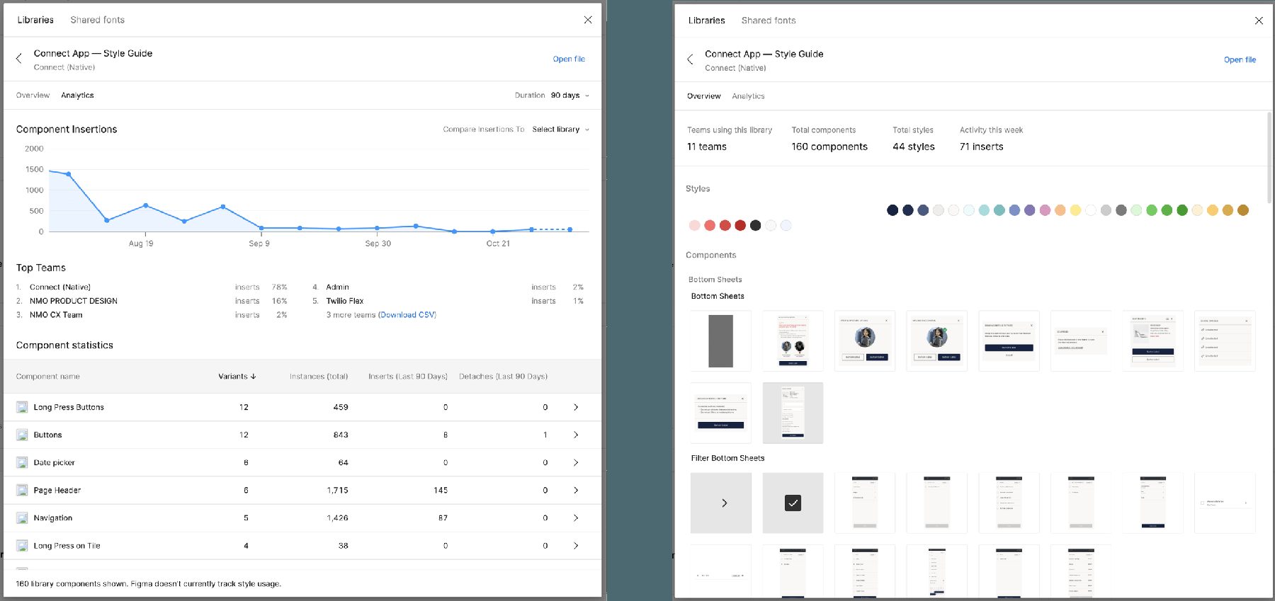
I created a design system that is now used by 9 teams across the organization, with over 150 components.
Wrap up
The implementation of the design system contributed to the business by:
- Significantly reducing screen design time, leading to quicker execution and handoff to engineers
- Empowering engineers to verify components for pixel-perfect execution
- Establishing a centralized point of reference for designers to validate their work